2025
Etsy
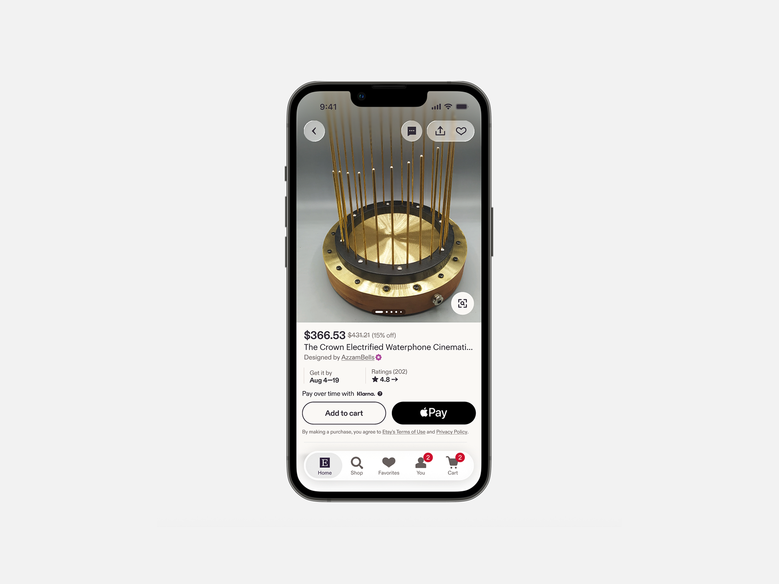
Etsy iOS Listing Screen
Bringing trust and clarity to one of Etsy's most trafficked surfaces, one experiment at a time.
Bringing trust and clarity to one of Etsy's most trafficked surfaces, one experiment at a time.

I was the sole designer on this squad, one of four squads in Etsy's Buyer Trust initiative, all nested under a new Growth org. The squad included a PM, an engineering manager, and about nine engineers. I owned all design decisions for the iOS Listing screen, from strategy through execution.
The path to this role took some turns. I started 2025 spread across two squads after a reorg, covering gaps as the org found its footing. By mid-year, I'd consolidated onto one team full-time, and we'd claimed the listing screen as our focus. Not because it was assigned to us, but because it was a critical surface that needed attention.
The listing screen is Etsy's most trafficked surface. It gets almost 3x as many daily visits as search, and it's a big part of where buyers decide to make a purchase or not. But according to our research and data, only 21% of buyers scrolled past the first viewport, they spent an average of 5.5 seconds deciding to bounce or keep reading, and the page was consistently described as "dense" and "overwhelming."
The core problem wasn't just clutter. It was trust.
Buyers couldn't quickly assess whether an item was right for them, whether the seller was legitimate, or whether Etsy itself was a safe place to shop.
With the framework in place, we started building.
The mandate from the Growth org was simply to drive conversion, and to experiment at a high velocity. But optimizing without a framework can lead to spinning your wheels, so I pushed for us to develop a point of view to anchor all of our ideas and work to.
Since teams were still figuring out ownership, and the listing screen had been experimented on by many groups over the years without a cohesive point of view, I ran a design sprint with the squad early on to map the page, identify pain points, and generate a backlog of ideas. A few months later, with a new design director we ran another larger sprint that pulled in designers from other squads and teams. Both gave us direction and a library of experiments to pull from throughout the year.
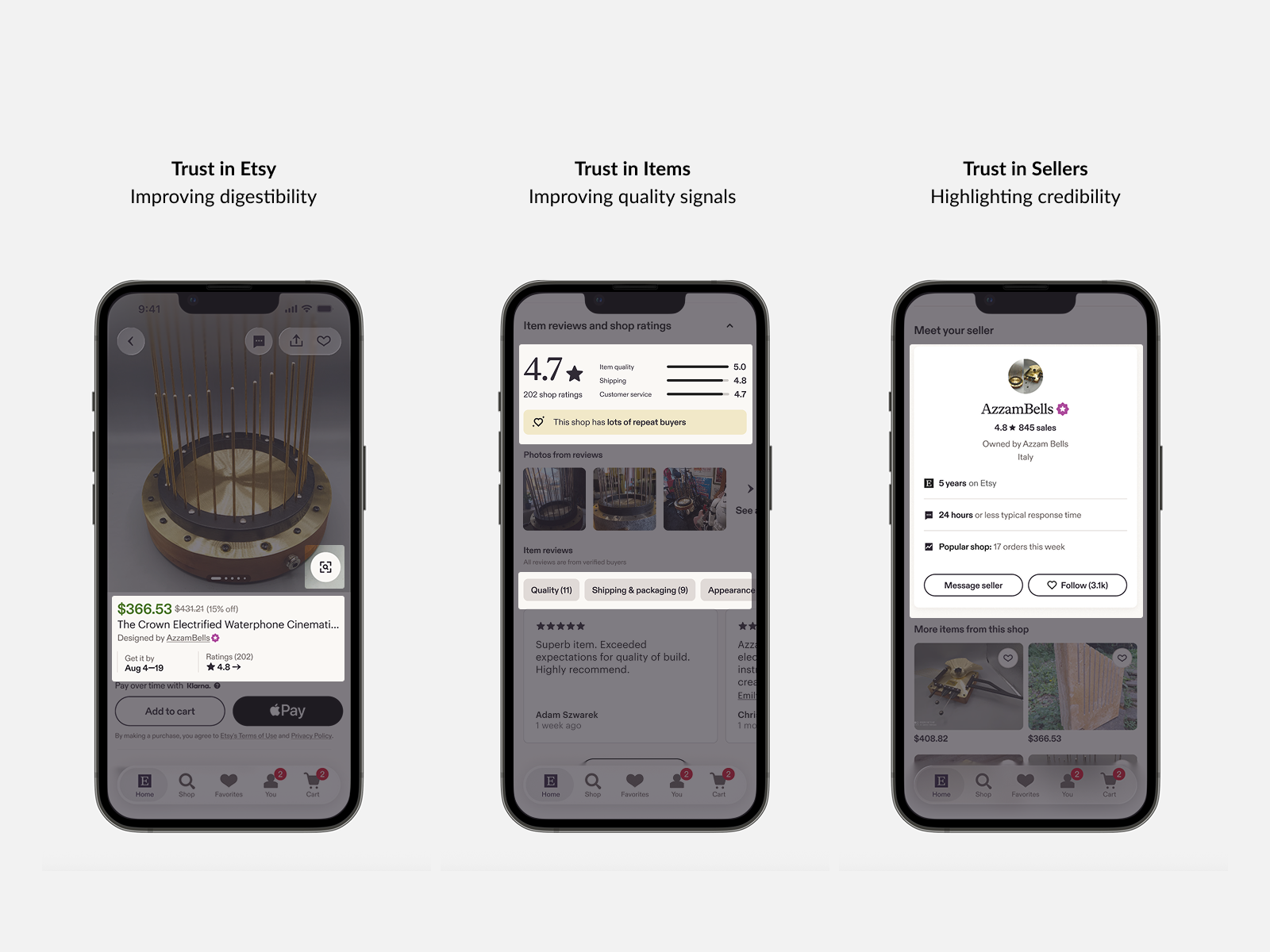
Trust in Etsy: Reducing cognitive overload, making the listing scannable, so buyers feel confident shopping on the platform.
Trust in Items: Surfacing quality signals like reviews and social proof, so buyers can evaluate whether a product meets their needs.
Trust in Sellers: Showcasing seller credibility and enabling conversation, so buyers feel confident purchasing from an individual maker.
Throughout the year, we made updates to nearly every part of the page. These ranged from significant refreshes and new modules to subtle adjustments in typography, spacing, and UI elements. While some changes were small on their own, collectively they contributed to a more modern and cohesive user experience. Among the many experiments we ran, a few stood out as representative of the improvements we made.
The first viewport is where most evaluation happens. We streamlined it by consolidating signals, updating type hierarchy, improving key details placement, and reducing banner noise.
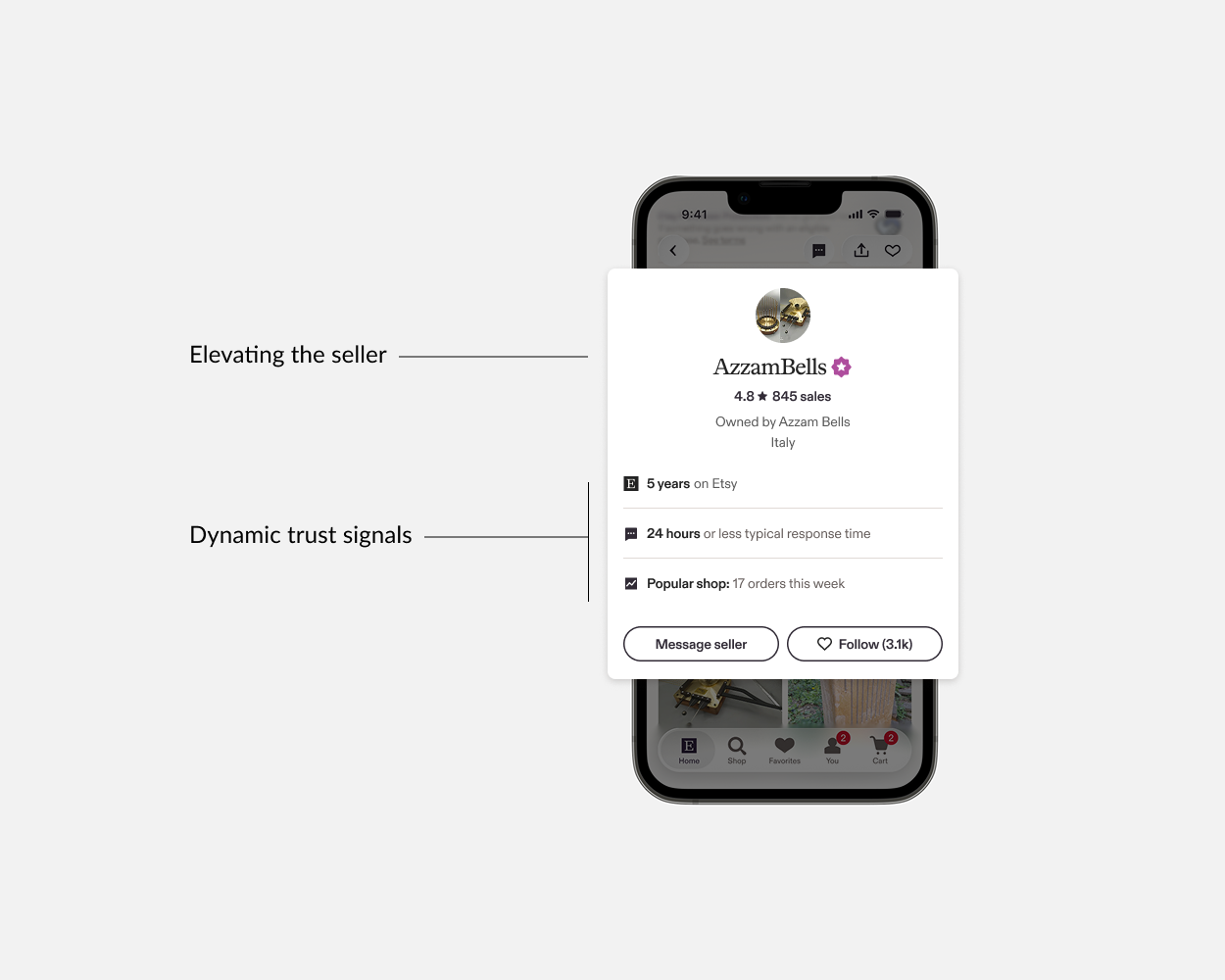
Buyers often left the listing to visit the shop home page, looking for signals that the seller was trustworthy. We launched a new "Meet Your Seller" module, surfacing that info about tenure on Etsy, response time and social proof into a consolidated module.
Reviews are one of the strongest trust signals, but they can be hard to scan. We added AI-generated category tags (appearance, quality, seller service) that let buyers quickly filter to relevant feedback. We also updated the UI, typography, and information display and hierarchy to align with the newer cleaner brand styles, and make it easier for buyers to skim the page and discern key information.
Over the course of 2025, we ramped a series of experiments to all iOS users. Some moved business metrics directly. Others improved trust behaviors or cleaned up the experience without harming economics. Together, they added up to a more coherent, scannable listing screen.
In November 2025, the org restructured. Our team moved from Growth into a new Buyer-facing product org, keeping the same track of work but with expanded scope and more latitude for long-term improvements. The listing screen work continues into 2026 and several patterns I designed for iOS informed cross-platform experiments on Android and web.
I think of this project as evidence that operating with vision and operating with craft aren't mutually exclusive. With the framework of increasing buyer trust, we stepped back to look at the listing screen not as a collection of independent modules to optimize, but as an experience that needed to earn buyer confidence and stay coherent. That kind of thinking shaped what we chose to work on and how we evaluated whether it was adding up to something meaningful.
And the importance we placed on executing well made the work durable enough to influence other teams and earn the team expanded scope.
I also reminded of the value of working within constraints. There's no perfect situation and the org was new, the strategy shifted, and teams were sorting out ownership. But instead of waiting for clarity, we found a space that needed attention and made steady progress.